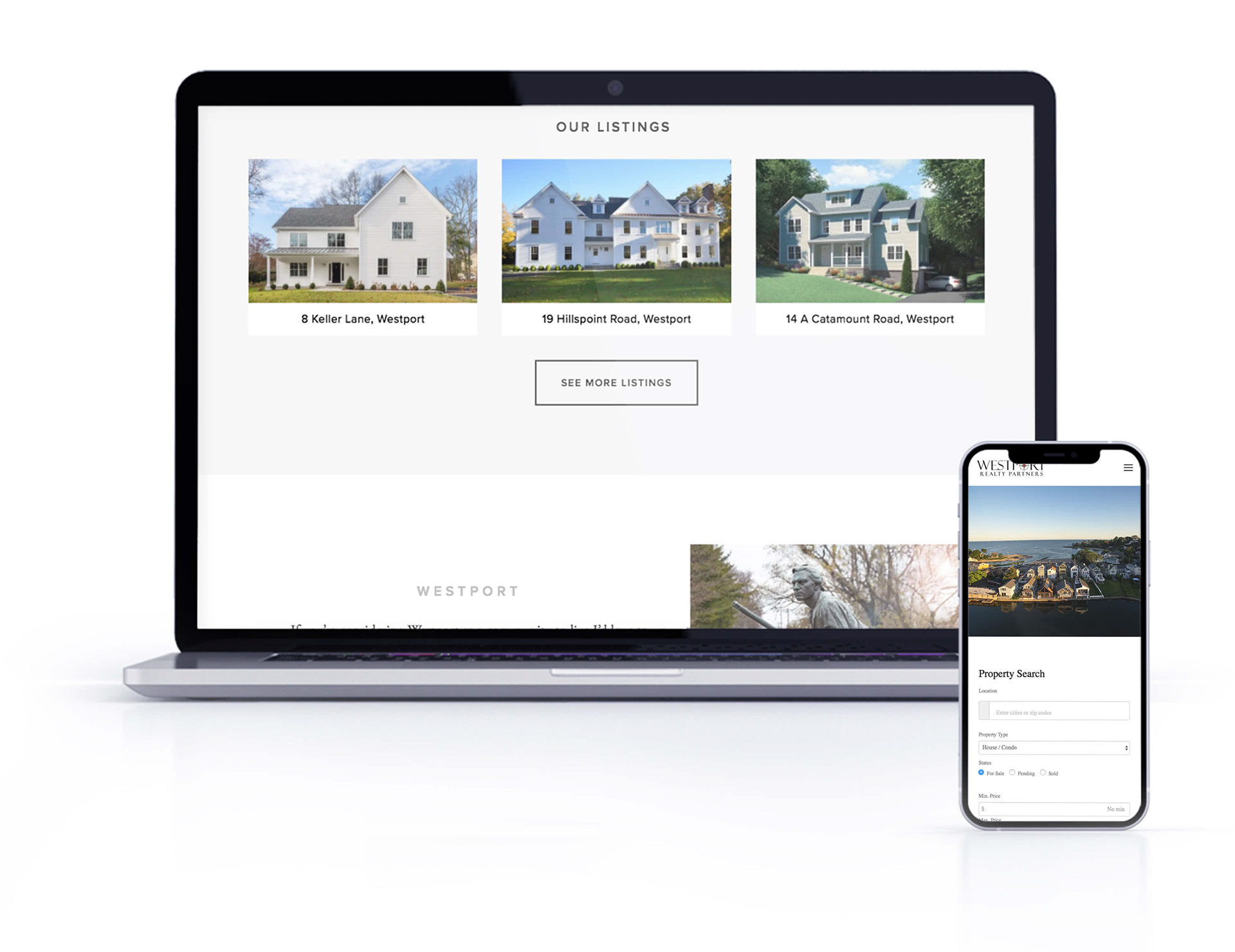
Westport Realty Partner wanted a modern-looking website that would highlight Westport as a perfect place to find your new home.
Using a black and white color scheme I tried to highlight the beautiful photography of Westport. Clean and simple layout allowed to organized all the information and create a user-friendly interface.

